|
| |||
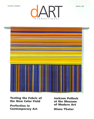
Testing the Fabric of the New Color Field by Michael Duncan Color Field painting for the '90s? So purports curator-writer David Pagel in a group show of new abstract work, Color Fields, presented this winter at the Luckman Gallery, Cal State LA. Pagel asserts that the works by these painters-all women and nearly all from LA-represent a return to the splashy, hue-drenched styles of Color Field, the '50s and '60s movement best exemplified by the stain paintings of Morris Louis and Helen Frankenthaler. That movement won acceptance, according to supporter Clement Greenberg, because its clarity and openness seemed so refreshing after the density and compactness of Abstract Ex- pressionism. The great Color Field works used saturated color to express spirituality (Rothko), to describe the effects of nature (Frankenthaler) and to create object-like presences or designs (Noland and Louis). Without such ambitions, however, the paintings-with their clarity and openness-tended to drift into vacuous simplemindedness- much like a slowly saturating dribble of paint. For me, a lack of ambition and conviction is the problem with the most hyped members of the so-called New Color Field movement. Nineties culture-with its fear of emotion and penchant for easy cynicism-has turned vacuous simplemindedness into a comic, nihilistic style: the slacker esthetic. Four of the seven painters in Pagel's show ease into abstraction with a slacker's lope, flaunting as badges of honor their deliberately limited scope and willfully reduced means. On its field of raw canvas, Monique Prieto's On the Other Side (1997) presents playfully colored blobs lackadaisically leaning against each other in clusters. Originally sketched out on a computer, Prieto's now trademark blobs are her paintings' building blocks. They define the slackers' comic appeal; too lazy to stand upright or flow evenly, they seem to loiter like lanky and plodding characters hanging out in the midst of a knowingly dumb Saturday morning cartoon. Prieto also often organizes her Teletubbie-like blobs in vertically stacked piles; these triple and quadruple scoop paintings feature carefully delineated marks that simulate real expressive drips. Such calculated effects confirm Prieto's painting as a kind of play-school activity parodying the notion of expression through paint. At best mildly humorous, her work offers the self-consciously hip a confirmation of their own reduced ambitions and low expectations. Simulated forms also organize Ingrid Calame's paintings. Her splashy, amorphous shapes are appropriated from spills of paint that she finds on floors and side to give them a glossy sheen. Calame's Cageian gimmick obviates content, logic or compositional rigor; her fill-in splashes at best sometimes resemble forms on maps or topographic charts. But their metaphorical resonances are limited and her synthetic, unevenly applied colors are at once glitzy and dull. Pae White is known for her ponderous, self-reflective comments on the intersection of art and commercial design. Here, in a venture into impure abstraction, three pools of colored solvent on mirrored plexiglas, all weirdly titled The Inconsolable Wailing of the Damned, create shimmering effects on the gallery ceiling. The colored reflections seem disconnected from their murky looking floor-pans of resin. With a clutzy obviousness, presumably intended as some kind of critique of the esthetic experience, White reveals the source of her pretty color effects as ugly, random systems of bubbles and splotches. Even more perverse, Laura Owens seems to want to invent a new style-or many new styles-of startlingly bad painting. Her first exhibited body of work included perspectival depictions from low, skewed angles of mostly empty gallery spaces. Here, in one of those large untitled paintings from 1997, the empty wall of a white-cube gallery takes centerstage, painted in an expressionless, seemingly rolled-on white. This is an airless, close-captioned, art-school joke with no punchline, no catharsis. The emptiness you see is the emptiness you get. In her last body of work shown at Acme, Owens turned her cynical eye to nature, deigning to sketch out a few branches and stain a few leaves while still filling large areas of canvas with her trademark wide-open space. One work featuring only a border of tree trunk around the periphery seems to pointlessly parody a Sam Francis edge painting. Owens' slackerish indecision, stalled compositions and hamfisted brushwork are in service of very tired critiques of sincerity and technique in painting. Happily, the other three artists in Pagel's exhibition don't have time for attitude. In her gorgeous new sculptural reliefs, Linda Besamer melds dried strips of colored acrylic paint to make virtuosic, double-sided, contrasting designs. Draped over rods to expose their two complementary sides, these precisely made slabs of paint are fascinating objects in which paint itself provides its own support. Similarly interested in process, New York artist Polly Apfelbaum arranges dyed pieces of crushed velvet and cotton into textured, free-flowing, complex compositions on the floor, Penelope Krebs' stripe paintings, juxtaposing unlikely, reverberating, off-kilter shades, are electric color studies based on sensory experience, evidencing a rigorous connoisseurship of color effects. Rather than referring to any single art historical movement, the works of these three painters resonate with a wide variety of abstract styles and ideas, including '60s geometric abstraction and '70s process art. In fact, running concurrently with Color Fields were exhibitions of works by several older LA artists whose explosive and inventive uses of color and abstract design provide quirky and fruitful contexts for the works of the younger experimenters. The new hard-edged geometric paintings exhibited by 73-year-old Karl Benjamin at Ruth Bachofner seem to pulse with the energy of their piquant color combinations and perspectival patterns. The new sexually charged pictographic abstractions by 77-year-old William Brice at LA Louver are rich, symbolic visual narratives told with in-your-face primary colors. At Tobey Moss Gallery, a 1962 painting by LA abstract master Lorser Feitelson featuring a massive, shimmering, boulder-shaped slab of orange more than justifies itself as a precisely articulated, metaphorically resonant, abstract colorform. With expansive, gorgeous works like these waiting to be celebrated, why hype the lame, the restrained and the slack? |
|||